Virgin Red
Elevated Virgin Red's design practice from assumption-driven to research-backed, establishing scalable content systems and cross-functional alignment processes.
Virgin Red is Virgin's cross-brand loyalty programme, designed to drive engagement across Virgin businesses and partner brands.
I was mainly responsible for content discovery experience, transforming how users found relevant offers across hundreds of partners.
Beyond solving the immediate design challenge, I established research driven processes and scalable content systems that elevated the team's design maturity.
Category:
Commerce / CMS
My Role:
Product Designer
Year:
2022
Team:
1 Research Lead, 1 Design Director, 1 PM, 4 Dev, 4 QA, 1 Tech Lead
Impact
Created scalable content management
Created a flexible content structure and tile system that enabled the content team to organise 100+ partner offers effectively, solving both immediate user needs and long-term scalability challenges.
Enabled data collection strategy
The "save to favourites" feature I introduced provided the data science team with behavioural signals to inform future personalisation efforts, a foundation absent in the previous system.
Positive users response to the update (scale from 1 to 10)
20%
rated 10
40%
rated 9
“I can easily discover brands I like or even those I didn't know it exists but fit my daily habits.”

Challenges
Assumption driven without research foundation
Product stakeholders requested adding promotional tags to existing content tiles, assuming this would improve engagement from partner brand members.
Lack of research
The team had no prior user research on discovery patterns, content preferences, or engagement drivers. I needed to quickly establish what users actually needed while managing expectations about timeline.
We served users ranging from highly engaged Virgin brand loyalists to casual partner brand shoppers. Each segment had different discovery motivations and content expectations that the existing structure couldn't accommodate.
Poor content organisation
The content team manually organised offers without a systematic framework, leading to inconsistent categorisation and poor discoverability for our users.
- Product Team -
“How can we help users to discover relevant content?”
“We believe adding promotional tag will help”
My approach - Challenge assumptions through evidence
Rather than immediately executing the promotional tag request, I reframed the problem: Why are users struggling with discovery? This required establishing research practices and building stakeholder trust in a design led process.
Partnered with a User Researcher to conduct audits, studies, and user testing.
Cross-functional workshops
Organised sessions with stakeholders to align on goals and explore potential solutions.
Iterative prototyping
Rapid testing and refining of designs based on feedback.
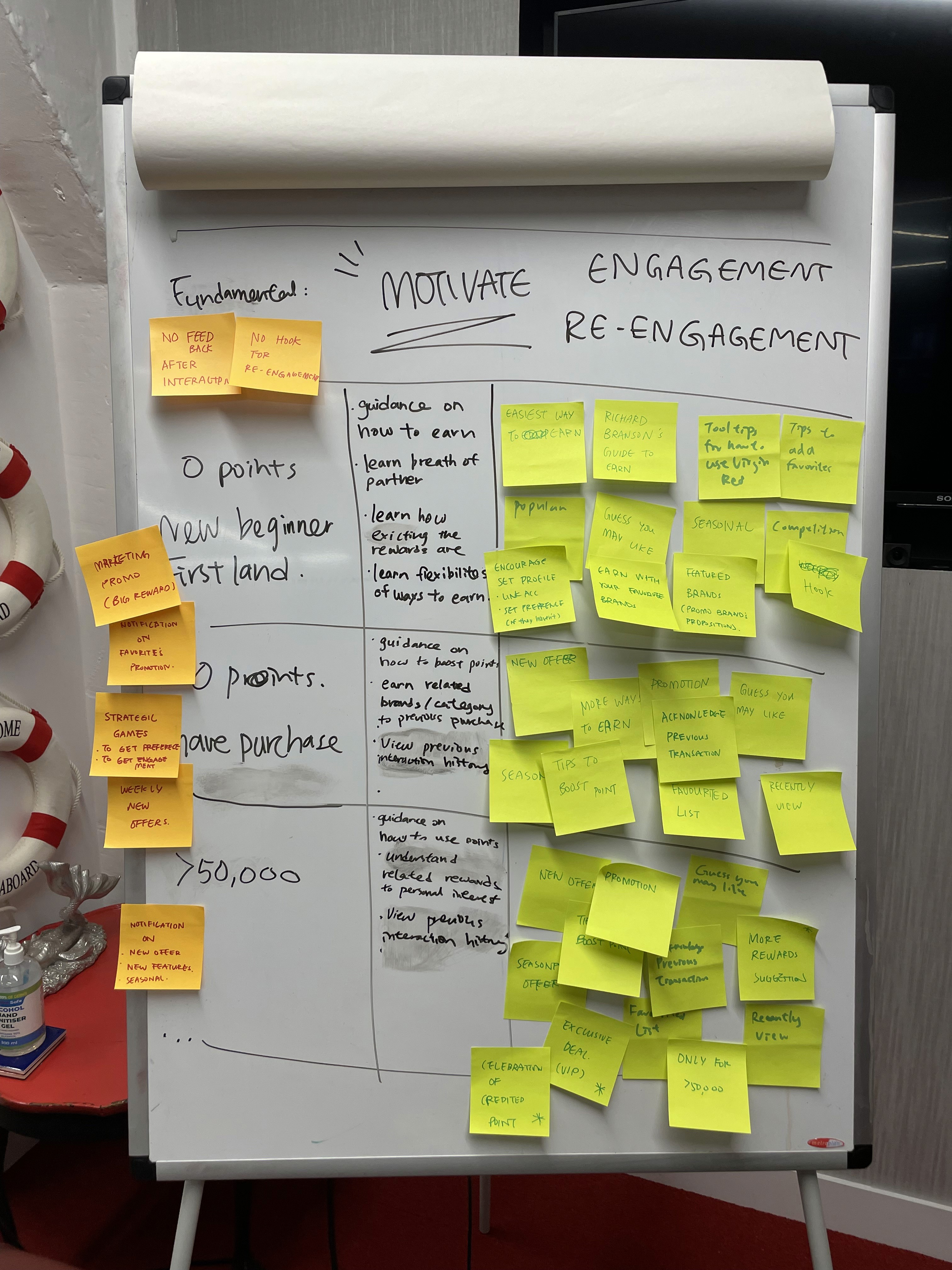
Workshop with internal team (left) and quick iterations prototype for user testing (right)
Research Findings: Users prioritize brand affinity over promotions
Through interviews and behavioral analysis, I uncovered a critical insight that contradicted the business assumption. Users weren't motivated by promotional tags or Virgin-curated content. They wanted:
Brand-first discovery
Find offers from brands they already love (e.g., coffee shops they frequent).
Habit alignment
See how their existing shopping behaviuors could earn points.
Exploration efficiency
Quickly assess if Virgin Red fit their lifestyle without browsing hundreds of offers.
“I am interested to know about the brands I like more than exploring what offer Virgin provide, as I want to know I can earn points in a way that fit my shopping habits ”
- Prospective Users -
Demonstrating scalability concerns through design audit
To build stakeholder buy-in for a different approach, I conducted a comprehensive content audit that made the systemic problems visible:
Video below shows the content audit I did to break down the possibilities I could improve to form certain structure that helps our users discover content

Audit result below, listing how we currently present information inconsistently
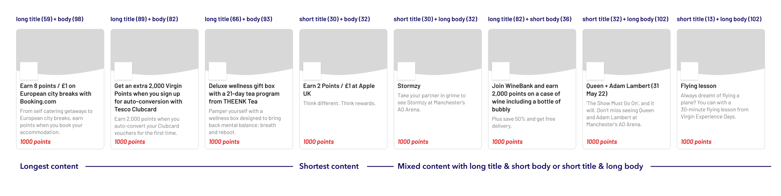
By visualising the chaos through the audit, I shifted the conversation from "should we add tags" to "we need a systematic content structure." This created buy-in for a more substantial redesign.
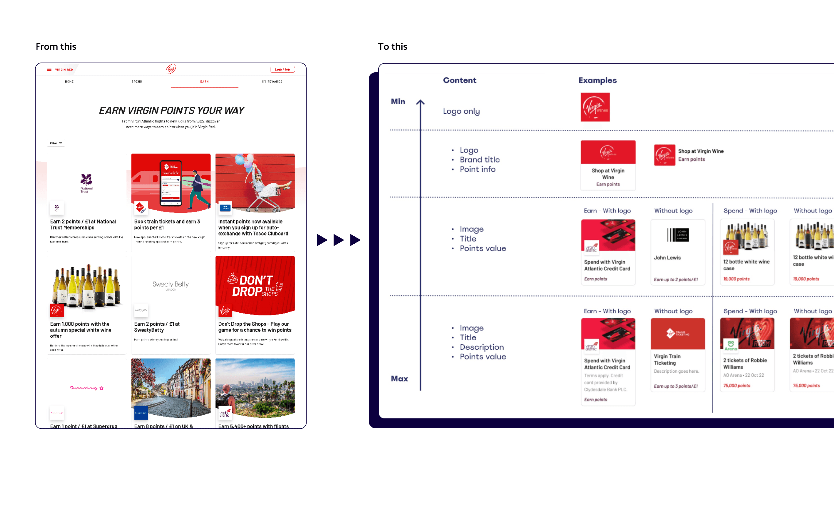
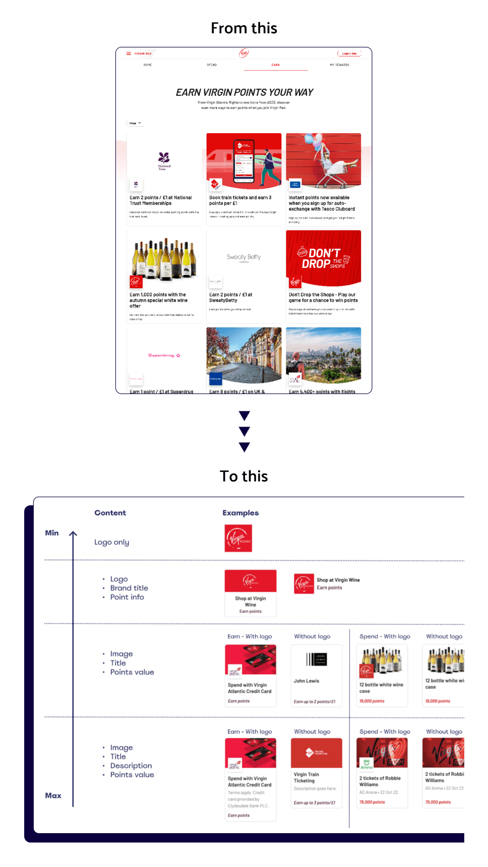
Solution - Systematic content architecture with flexible presentation
Sustainable content structure
Designed a hierarchical content system organised around user discovery patterns.
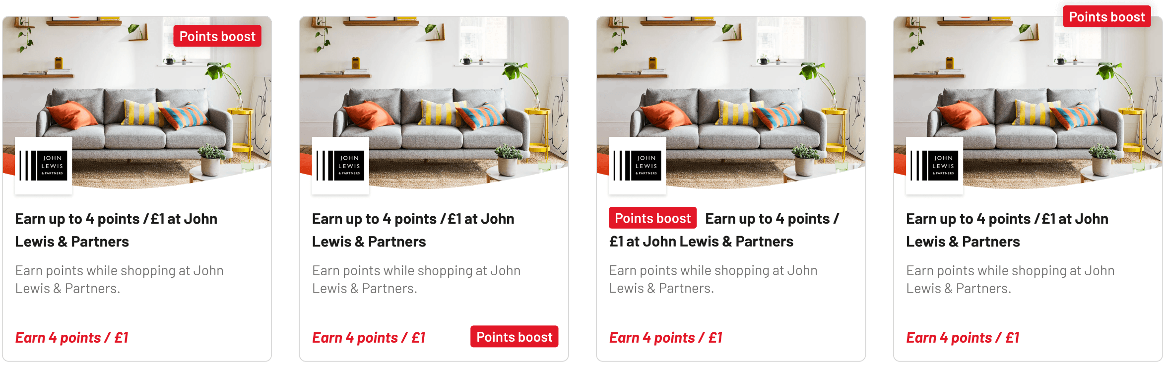
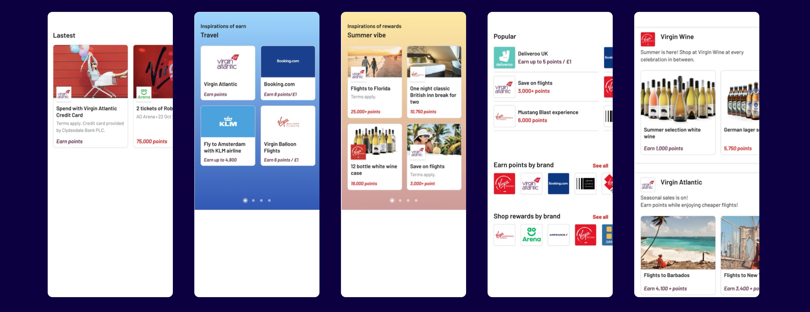
Dynamic tile system
Created a modular tile component system with defined use cases from featured, standard to compact tile.
Rapid test on Userzoom.com
Unmoderated testing with participants to validate information hierarchy decisions and measure task completion rates.
Implication of new content structure to serve different marketing goal
Result - Short-term feature with long-term infrastructure
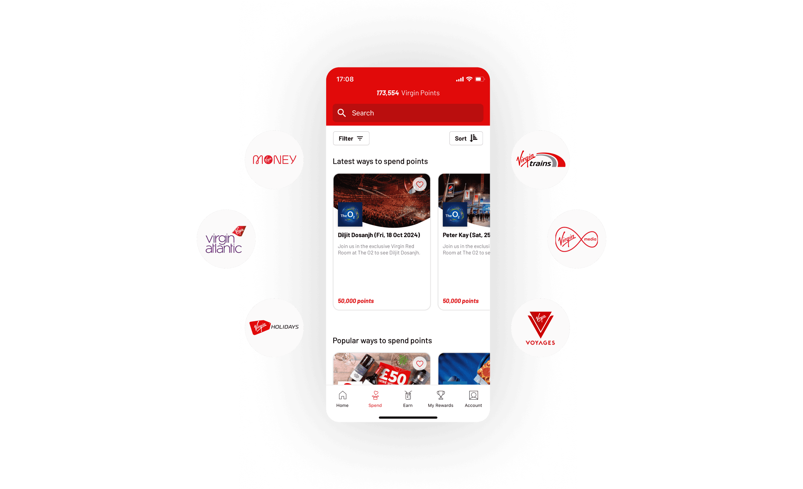
Introduce the "save-to favourite" features
For immediate users value, we allow users to save different brands for quick discovery while taking time to improve the proposed structure.
Content team empowerment
With improved structure, content team are able to have better guidance on what to provide that fit our users' needs.
Data foundation for personalisation
"save-to-favourite" feature created a foundation for future ML-driven personalisation that the product team could roadmap.
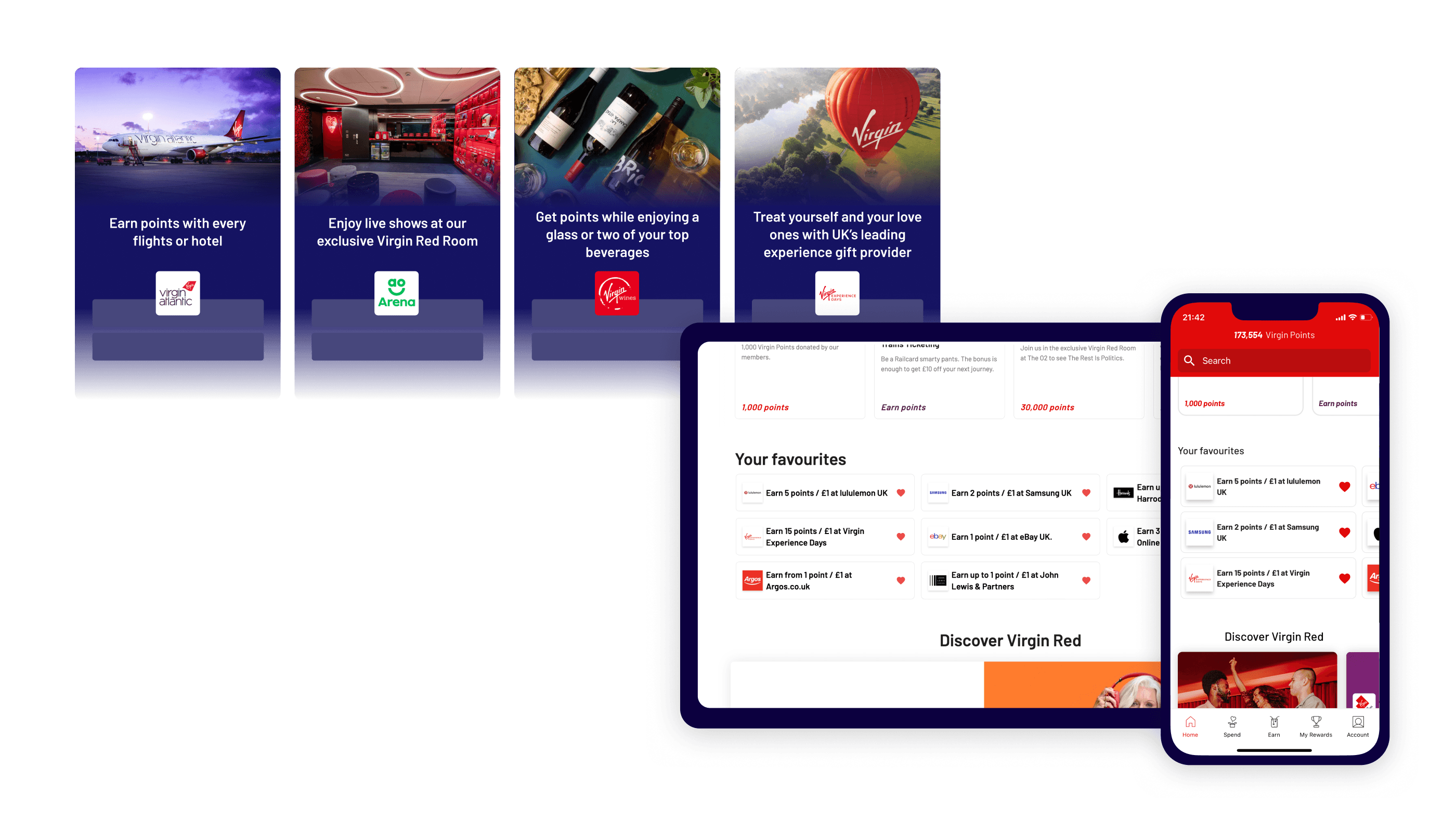
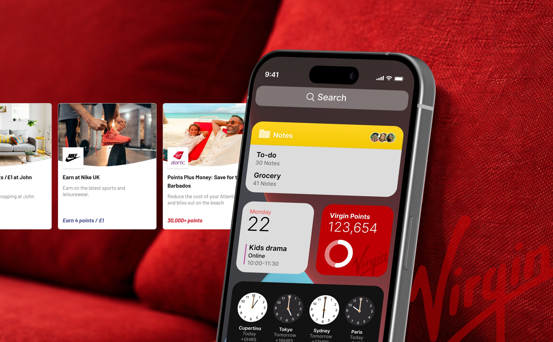
Responsive favourite list implemented for users to quick access their saved brands
Revisiting the project
Physical-digital integration
Based on the insight that users wanted Virgin Red to align with their existing habits, I explored concepts that extended beyond the app interface, including goal setting widget and location aware notification.
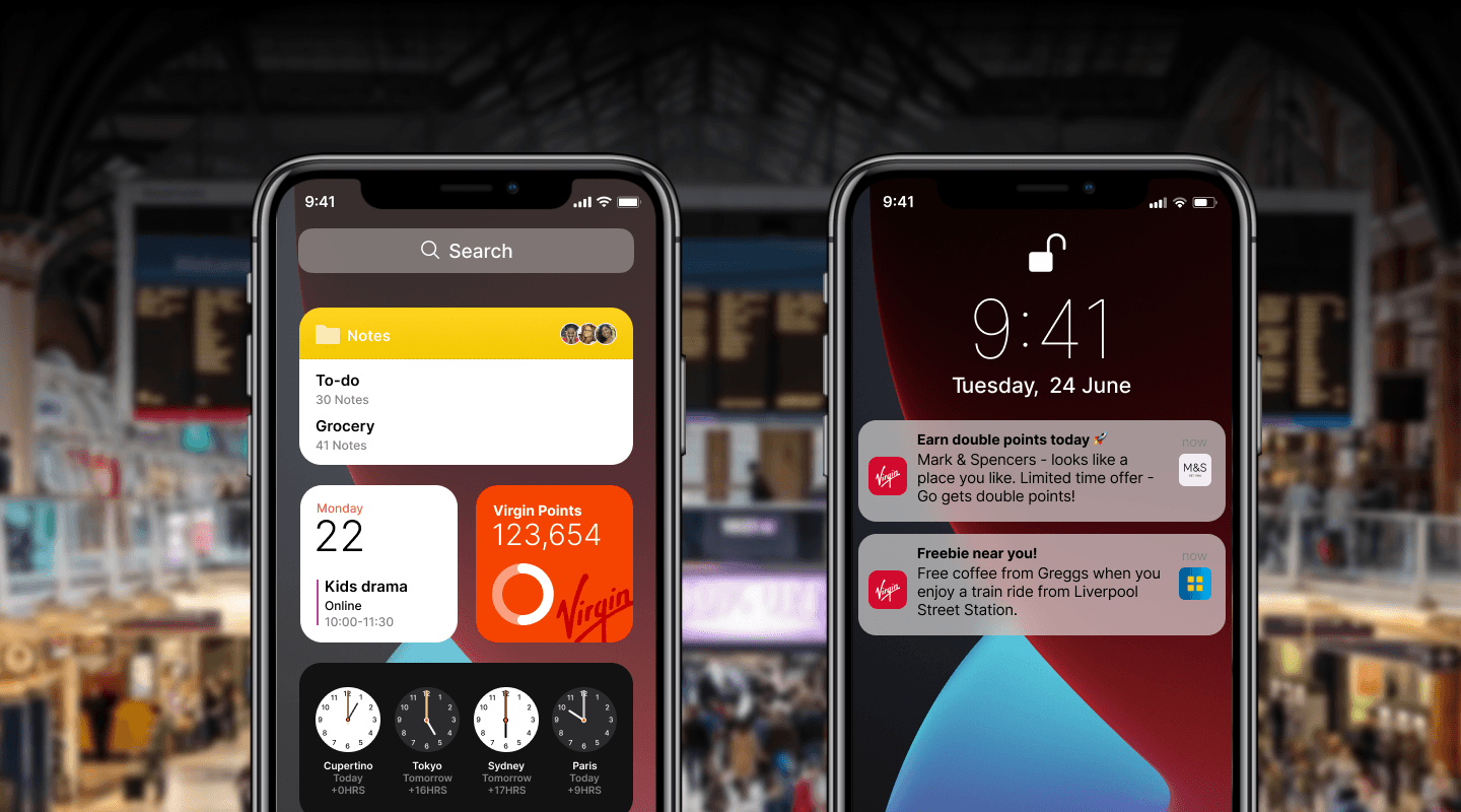
Ideation mock up: (Left) Widget to set goal of earning points. (Right) Notification relating to interaction around physical world